stories
 story-1
 story-2
 story-3
 story-4
 story-5
story-1story-2story-3story-4story-5revision:
            <div>
                <div class="div1">static</div>
                <div class="div2">dynamic - @keyframes</div>
                <div class="div3">static - to bottom</div>
                <div class="div4">static - to left bottom corner</div>
            </div>
            <style>
                .frame{margin-left: 10vw;}
                .div1{ width: 40vw; height: 10vw; border:0.5vw solid darkblue; background-image: repeating-linear-gradient(45deg, #606dbc, #606dbc 10px, #465298 10px, #465298 20px); color: aliceblue;}
                .div2{width: 40vw; height: 10vw; border:0.5vw solid darkblue; animation: coloring 10s infinite;color:aliceblue;}
                @keyframes coloring{
                    0%{background-image: repeating-linear-gradient(45deg, darkgrey, yellow, tomato);}
                    25%{background-image: repeating-linear-gradient(55deg, tomato, yellow, darkgrey);}
                    50%{background-image: repeating-linear-gradient(65deg, darkgrey, yellow, tomato);}
                    75%{background-image: repeating-linear-gradient(35deg, tomato, yellow, darkgrey)}
                    100%{background-image: repeating-linear-gradient(45deg, darkgrey, yellow, tomato);}
                }
                .div3{ width: 40vw; height: 10vw; border:0.5vw solid darkblue; background-image: repeating-linear-gradient(to bottom, #606dbc, #606dbc 10px, #465298 10px, #465298 20px); color:aliceblue;}
                .div4{ width: 40vw; height: 10vw; border:0.5vw solid darkblue; background: repeating-linear-gradient(45deg,rgba(0, 0, 0, 0.2), rgba(0, 0, 0, 0.2) 10px, rgba(0, 0, 0, 0.3) 10px, rgba(0, 0, 0, 0.3)
                    20px),url('../images/2.jpg');background-repeat: space;color:aliceblue;}
            </style>
story-1story-2story-3story-4story-5
<div class="tale">A tale of satisfaction
<div class="stories">stories
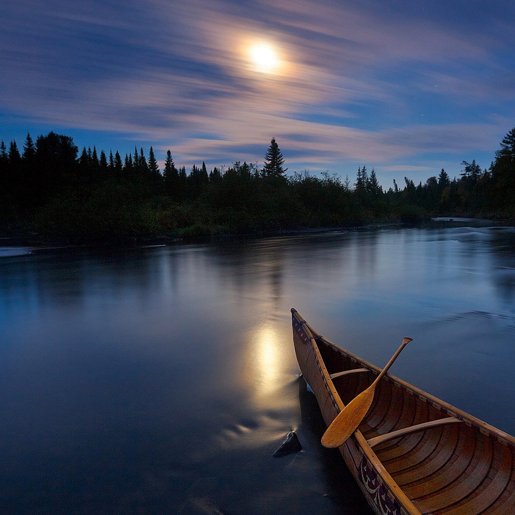
<div class="story-1"><img src="../images/1.jpg" alt=""/>story-1</div>
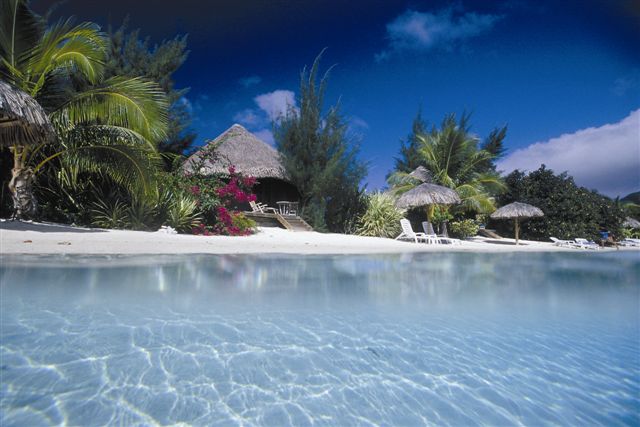
<div class="story-2"><img src="../images/2.jpg" alt=""/>story-2</div>
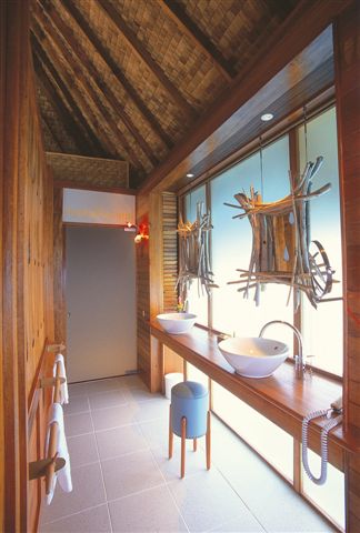
<div class="story-3"><img src="../images/3.jpg" alt=""/>story-3</div>
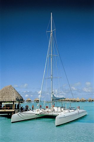
<div class="story-4"><img src="../images/4.jpg" alt=""/>story-4</div>
<div class="story-5"><img src="../images/5.jpg" alt=""/>story-5</div>
</div>
</div>
<style>
.tale{position: relative; margin: 0 auto; background-image: url(../images/8.jpg); background-size: cover; background-position: center; overflow: hidden; width: 40vw; height: 60vw; padding: 1vw;
margin: 2vw auto; background-color: cyan; box-shadow: 2px 4px 16px rgba(0, 0, 0, 0.2); color: aliceblue;}
.stories{display: grid; grid-template-columns: 3fr repeat(4, 1fr) 2fr; position: absolute; left: -20%; right: -20%; bottom: -10%; top: 20%; transform: rotate(-20deg) translateY(100px);}
[class^=story-] {background-color: lightblue; background-size: cover; color: red;}
[class^=story-] >img {width:50%; height: 100%; object-fit: cover;}
.story-1 {grid-column: 1 / 1; grid-row: 1; clip-path: polygon(1% 2%, 98.5% 15.75%, 89% 100%, 0 100%); transform: translate3d(0, 0, 40px); }
.story-1 >img {clip-path: polygon(1% 2%, 98.5% 15.75%, 89% 100%, 0 100%); transform: scale(0.95); transform-origin: 70% 22%; }
.story-2 { position: relative; grid-column: 1 / span 3; grid-row: 1; z-index: 1; clip-path: polygon(59.51% 16.01%, 80.2% 18.43%, 86% 100%, 54% 100%);}
.story-2 >img { position: absolute; width: 140%; height: 140%; object-fit: fill; clip-path: polygon(42.69% 11.52%, 57.23% 13.1%, 60.22% 55.28%, 39.96% 51.88%); transform: scale(0.95);
transform-origin: 50% 20%;}
.story-3 {position: relative; grid-column: 3 / span 4; grid-row: 1; clip-path: polygon(0.59% 18.42%, 20.97% 20.56%,77.79% 71.46%, 63.78% 100.53%, 5.52% 79.63%);z-index: 2;}
.story-3 > img {position: absolute; top: 120px; left: -20px; width: 74%; height: 70%; clip-path: polygon(7.08% 0.1%, 35.11% 3.17%, 123.54% 87.61%, 96.26% 103.9%, 14.09% 88.78%);
transform: scale(0.95); transform-origin: 28% 20%;}
.story-4 { grid-column: 4 / span 4; grid-row: 1; clip-path: polygon(1.5% 20.49%, 25.08% 19.07%, 86.59% 31.01%, 58.76% 61.02%); z-index: 1;}
.story-4 >img {clip-path: polygon(2.09% 20.06%, 25.08% 18.64%, 86.59% 30.58%, 59.93% 60.88%); transform: scale(0.95);transform-origin: 14% 35%;}
.story-5 {grid-column: 5 / span 2; grid-row: 1; clip-path: polygon(1% 18.82%, 33.03% 14.35%, 99.7% 16.36%, 69.34% 29.11%); transform: translate3d(0, 0, 200px);}
.story-5 >img {clip-path: polygon(2.83% 18.08%, 34.17% 13.61%, 99.7% 15.62%, 76.89% 28.96%); transform: scale(0.95);transform-origin: 14% 35%;}
</style>
            <div class="a">
                <div id="circle"></div>
            </div>
            <style>
            .a{width:40vw; height: 100vh; background: radial-gradient(#0B853D 3px, transparent 5px, #000 7px, transparent 9px, #0B853D 11px, transparent 13px,  15px, transparent 17px, #000 19px, transparent 21px,
                #0B853D 23px, transparent 25px, #fff 27px, transparent 29px, #000 31px, transparent 33px);background-color:#000; background-size: 32px 32px; overflow:hidden; margin:2vw;}
            #circle {width: 40vw; height: 100vh; top:0; left:0; right:0; bottom:0; margin:auto; position:relative; background: radial-gradient(#0B853D 3px, transparent 5px, #000 7px, transparent 9px, #0B853D 11px,
                transparent 13px,  15px, transparent 17px, #000 19px, transparent 21px, #0B853D 23px, transparent 25px, #fff 27px, transparent 29px, #000 31px, transparent 33px);background-size: 3vw 3vw;}
                .a { -webkit-animation: adjustHue loading 1s alternate infinite; animation: adjustHue loading 1s alternate infinite;}

                @keyframes adjustHue {
                    0% { -webkit-filter: hue-rotate(30deg); }
                    50% { -webkit-filter: hue-rotate(60deg); }
                    100% { -webkit-filter: hue-rotate(90deg); }
                }

                @-webkit-keyframes adjustHue {
                    0% { -webkit-filter: hue-rotate(30deg); }
                    50% { -webkit-filter: hue-rotate(60deg); }
                    100% { -webkit-filter: hue-rotate(90deg); }
                }
                @-webkit-keyframes loading {
                    to { -webkit-transform: rotate(360deg); }
                }
                @-moz-keyframes loading {
                    to { -moz-transform: rotate(360deg); }
                }
                @-ms-keyframes loading {
                    to { -ms-transform: rotate(360deg); }
                }
                @keyframes loading {
                    to { transform: rotate(360deg); }
                }
                #circle {-webkit-animation-name: blinker; -webkit-animation-duration: 3s; -webkit-animation-timing-function: linear;
                    -webkit-animation-iteration-count: infinite;  -moz-animation-name: blinker; -moz-animation-duration: 3s;
                    -moz-animation-timing-function: linear;-moz-animation-iteration-count: infinite; animation-name: blinker;
                    animation-duration: 3s; animation-timing-function: linear; animation-iteration-count: infinite; color: red; }

                @-moz-keyframes blinker {
                    0% { opacity: 1.0; }
                    50% { opacity: 0.3; }
                    100% { opacity: 1.0; }
                }

                @-webkit-keyframes blinker {
                    0% { opacity: 1.0; }
                    50% { opacity: 0.3; }
                    100% { opacity: 1.0; }
                }

                @keyframes blinker {
                    0% { opacity: 1.0; }
                    50% { opacity: 0.3; }
                    100% { opacity: 1.0; }
                }

            </style>
color:
            <div id='one-one'>
                <h4 id="one-h4">Color generator</h4>
                <b>current colors for gradient background:</b>
                <!-- Default color for gradient -->
                <input class="color1" type="color" value="#0000ff" />
                <input class="color2" type="color" value="#add8e6" />
                <p>color:<span id="result"></span></p>
            </div>
            <style>
                #one-one{width:30vw; height: 20vw; font: "Roboto";text-align: center; background: linear-gradient(to right, #0000ff, #add8e6);margin-left: 2vw;}
                #one-h4{margin-left: -10vw; font-size: 1vw; color: Black;}
                .color1, .color2{width: 3vw;}
                #result{margin: 0; font-size: 0.9vw; color: orange;}
            </style>
            <script>
                var css = document.querySelector("#result");
                var color1 = document.querySelector(".color1");
                var color2 = document.querySelector(".color2");
                var one = document.querySelector("#one-one");
                // Changing color for the gradient
                function changeGradient() {
                one.style.background = "linear-gradient(to right, " + color1.value + ", "  + color2.value + ")";
                css.textContent = one.style.background + ";";
                }
                color1.addEventListener("input", changeGradient);
                color2.addEventListener("input", changeGradient);
            </script>
            <canvas id="Canvas">Your browser does not support the HTML5 canvas tag.</canvas>
            <style>
                #Canvas{width: 45vw; height: 20vw; border:0.5vw solid burlywood; margin-left: 2vw;}
            </style>
            <script>
                var c = document.getElementById("Canvas");
                var ctx = c.getContext("2d");
                // Create gradient
                var grd = ctx.createLinearGradient(0,0,200,0);
                grd.addColorStop(0,"red");
                grd.addColorStop(1,"white");
                // Fill with gradient
                ctx.fillStyle = grd;
                ctx.fillRect(10,10,250,130);
            </script>
            <div id="gradient1"></div>
            <style>
                #gradient1{display:block; max-width: 45vw; min-height: 20vw; margin-left: 2vw;}
            </style>
            <script>
                const gradient = document.getElementById("gradient1");
                gradient.style.background = "linear-gradient(red, blue, green)";
            </script>
            <canvas id="Canvas2" width="2" height="2"></canvas>
            <style>
                #Canvas2 {display: block; width: 30vw; height: 20vw; }
            </style>
            <script>
                var canvas = document.querySelector('#Canvas2');
                var ctx = canvas.getContext('2d');

                function Pixel( x, y ) {
                    this.x = x;
                    this.y = y;
                    this.hue = Math.floor( Math.random() * 360 );
                    var direction = Math.random() > 0.5 ? -1 : 1;
                    this.velocity = ( Math.random() * 30 + 20 ) * 0.01 * direction;
                }

                Pixel.prototype.update = function() {
                    this.hue += this.velocity;
                };

                Pixel.prototype.render = function( ctx ) {
                    var hue = Math.round( this.hue );
                    ctx.fillStyle = 'hsl(' + hue + ', 100%, 50% )';
                    ctx.fillRect( this.x, this.y, 1, 1 );
                }

                var pixels = [
                    new Pixel( 0, 0 ),
                    new Pixel( 1, 0 ),
                    new Pixel( 0, 1 ),
                    new Pixel( 1, 1 ),
                ];

                function animate() {
                    pixels.forEach( function( pixel ) {
                        pixel.update();
                        pixel.render( ctx );
                    });
                    requestAnimationFrame( animate );
                }
                animate();
            </script>
            <div id="gradient2"></div>
            <style>
                #gradient2{ width: 30vw; height: 20vw; padding: 0vw;  margin: 0vw;}
            </style>
            <script>
            var colors = new Array(
                    [62,35,255],
                    [60,255,60],
                    [255,35,98],
                    [45,175,230],
                    [255,0,255],
                    [255,128,0]);

                var step = 0;
                    //color table indices for:
                    // current color left
                    // next color left
                    // current color right
                    // next color right
                var colorIndices = [0,1,2,3];
                    //transition speed
                var gradientSpeed = 0.002;

                function updateGradient() {

                    if ( $===undefined ) return;

                    var c0_0 = colors[colorIndices[0]];
                    var c0_1 = colors[colorIndices[1]];
                    var c1_0 = colors[colorIndices[2]];
                    var c1_1 = colors[colorIndices[3]];

                    var istep = 1 - step;
                    var r1 = Math.round(istep * c0_0[0] + step * c0_1[0]);
                    var g1 = Math.round(istep * c0_0[1] + step * c0_1[1]);
                    var b1 = Math.round(istep * c0_0[2] + step * c0_1[2]);
                    var color1 = "rgb("+r1+","+g1+","+b1+")";

                    var r2 = Math.round(istep * c1_0[0] + step * c1_1[0]);
                    var g2 = Math.round(istep * c1_0[1] + step * c1_1[1]);
                    var b2 = Math.round(istep * c1_0[2] + step * c1_1[2]);
                    var color2 = "rgb("+r2+","+g2+","+b2+")";

                    $('#gradient2').css({
                    background: "-webkit-gradient(linear, left top, right top, from("+color1+"),
                    to("+color2+"))"}).css({
                        background: "-moz-linear-gradient(left, "+color1+" 0%, "+color2+" 100%)"});

                    step += gradientSpeed;
                    if ( step >= 1 )
                    {
                        step %= 1;
                        colorIndices[0] = colorIndices[1];
                        colorIndices[2] = colorIndices[3];

                        //pick two new target color indices
                        //do not pick the same as the current one
                        colorIndices[1] = ( colorIndices[1] + Math.floor( 1 + Math.random() *
                        (colors.length - 1))) % colors.length;
                        colorIndices[3] = ( colorIndices[3] + Math.floor( 1 + Math.random() *
                        (colors.length - 1))) % colors.length;

                    }
                }
                setInterval(updateGradient,10);
            </script>
            <canvas id="Canvas3">Your browser does not support the HTML5 canvas tag.
            <canvas>
                <style>
                        #Canvas3{width: 45vw; height: 20vw; border: 0.5vw inset burlywood; margin-left: 2vw;}
                </style>
                <script>
                    var c1 = document.getElementById("Canvas3");
                    var ctx1 = c1.getContext("2d");

                    // Create gradient
                    var grd1 = ctx1.createRadialGradient(75,50,5,90,60,100);
                    grd1.addColorStop(0,"red");
                    grd1.addColorStop(1,"white");

                    // Fill with gradient
                    ctx1.fillStyle = grd1;
                    ctx1.fillRect(10,10,250,120);
                </script>
a parallax effect occurs when the various parts of a page move at various speeds. A website's surfing experience can be enhanced by parallax scrolling making it more engaging and dynamic.
parallax scrolling is a technique used to make background images appear as if they're moving slower than their surrounding foreground elements when scrolling through a web page.
Note: parallax scrolling does not always work on mobile devices/smart phones. Parallax scrolling can be turned off by setting "background-attachment" to "scrolling". You also can use media queries to turn off the effect on mobile devices.
Use a container element and add a background image to the container with a specific height. Then use the "background-attachment: fixed"" to create the actual parallax effect. The other background properties are used to center and scale the image perfectly.
                    <div class="container">
                        <div class="parallax1" id="section1">
                            <a class="anchor" href="#section2">Section 1</a>
                        </div>
                        <div class="content">
                            <h3>Parallax Effect</h3>
                            <h4>Parallax is a displacement or difference in the apparent position
                            of an object viewed along two different lines of sight and is measured
                            by the angle or semi-angle of inclination between those two lines.</h4>
                            <h3>Floating Button</h3>
                            <h4>
                            Image result for floating button
                            A floating action button (FAB) performs the primary, or most common,
                            action on a screen. It appears in front of all screen content, typically
                            as a circular shape with an icon in its center.</h4>
                            <h3>Smooth Scroll</h1>
                            <h3>The smooth Scrolling feature for web pages allows the user to scroll
                            smoothly while navigating across a webpage. This feature came into wide use
                            because the normal scrolling is choppy and annoying for a lot of users who
                            have to read long pages on the web.</h3>
                        </div>
                        <div class="parallax2" id="section2">
                            <a class="anchor" href="#section1">Section 2</a>
                        </div>
                    </div>
                    <style>
                        #section1 {display: flex; justify-content: center; padding-top: 5vw;}
                        #section2 {display: flex; justify-content: center; padding-top: 5vw;}
                        .parallax1 {background: url("../images/flowers.jpg"); height: 20vh; background-repeat: no-repeat;
                        background-attachment: fixed; background-position: center; background-size: cover;}
                        .parallax2{background-image: url("img_pink_flowers.jpg"); position: relative; height: 20vw;
                        background-repeat: no-repeat; background-attachment: fixed; background-position: center;
                        background-size:
                        cover;}
                        .content{padding: 4vw 0 1vw; background: linear-gradient(109.6deg, #91EAE4 11.2%,#86A8E7 100.2%);
                            cursor: default;}
                        h3{display: flex; justify-content: center; margin: 0 auto 3vw; border: .2vw solid white; border-radius: 2.5vw;
                            max-width: 30vw; color: white; background: linear-gradient(109.6deg, rgb(255, 78, 80) 11.2%,
                            rgb(249,
                            212, 35) 100.2%); padding: 1vw;}
                        h4{ max-width: 50vw; margin: 0 auto 4vw; text-align: center; letter-spacing:.1vw; color: #4f3267;}

                    </style>
Scroll Up and Down this page to see the parallax scrolling effect.
                    <div class="container-1">
                        <p>Scroll Up and Down this page to see the parallax scrolling effect.</p>
                        <div class="parallax-1"></div>
                        <div style="height:40vh; width: 30vw; background-color:red; font-size: 1.4vw;">
                            Scroll Up and Down this page to see the parallax scrolling effect.
                            This div is just here to enable scrolling.
                            Tip: Try to remove the background-attachment property to remove the
                            scrolling effect.
                        </div>
                    </div>
                    <style>
                        .container-1{margin: 0; padding: 0;height: 50vh;}
                        .parallax-1{margin-top: 1vw;background-image: url("../images/car2.jpg");min-height: 50vh;
                        background-attachment: fixed; background-position: center; background-repeat:
                        no-repeat; background-size: cover;  }
                    </style>
                    <div class="container-2">
                        <div class="parallax-2"></div>
                        <div style="height:40vh; width: 30vw; background-color:red; font-size: 1.4vw;">
                            Scroll Up and Down this page to see the parallax scrolling effect.
                            This div is just here to enable scrolling.
                            Tip: Try to remove the background-attachment property to
                            remove the scrolling effect.
                        </div>
                        <div class="parallax-2"></div>
                    </div>
                    <style>
                        .container-2{margin: 0; padding: 0; height: 100%;}
                        .parallax-2{margin-top: 1vw;background-image: url("car2.jpg");height: 100%; background-attachment: fixed;
                        background-position: center; background-repeat: no-repeat; background-size: cover;  }
                    </style>